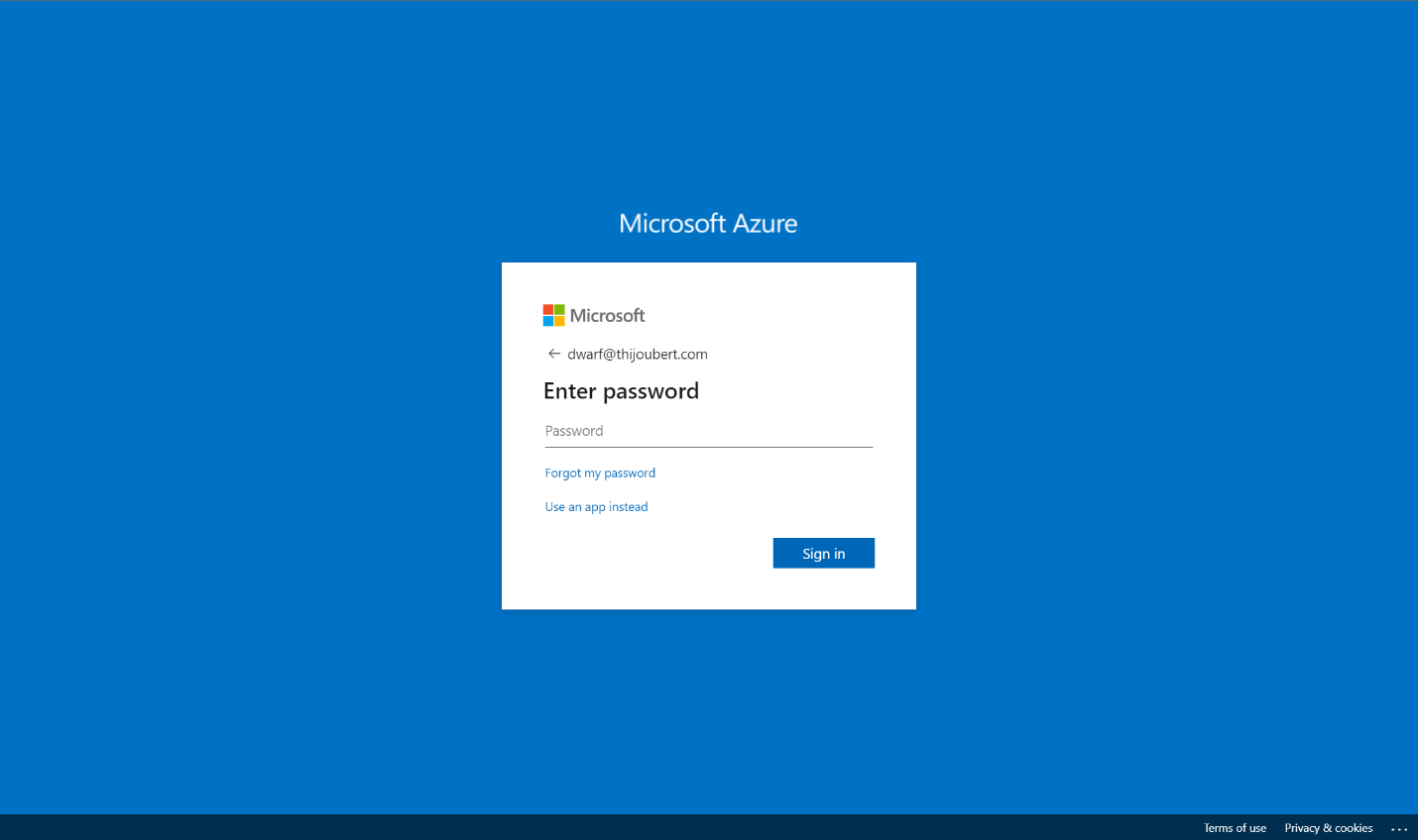
One of the windows that many customers of Microsoft services (about 250M daily users) see practically daily is the Azure AD login page.
At the end of 2022, Microsoft has improved the management and the parameters available to customize this page. This evolution, which is now in public preview, enables beyond customizing the image or background color, the company logo and an explanatory text to manage:
- A favicon for the browser tab
- A header with a reminder of the organization’s logo
- A footer with links to the terms of use, and a description of privacy and cookies
- A template between a predefined template (either classic or ADFS) or a custom template
This article aims to present how these evolutions will enable you to enhance the initial perception of your Office 365 tenant. The goal will be to adapt the corporate identity to create the best sign-in experience for the end users and the organization’s partners.
A reminder of the legacy company branding
It’s not big news, but the default sign-in page is not very user-friendly.
Microsoft allowed since 2017 to customize several settings for the authentication page :
- Background image for the main background image of the sign-in page
- Background color for the background color in case of failure to load the background image
- Banner logo for the organization logo in the main sign-in box
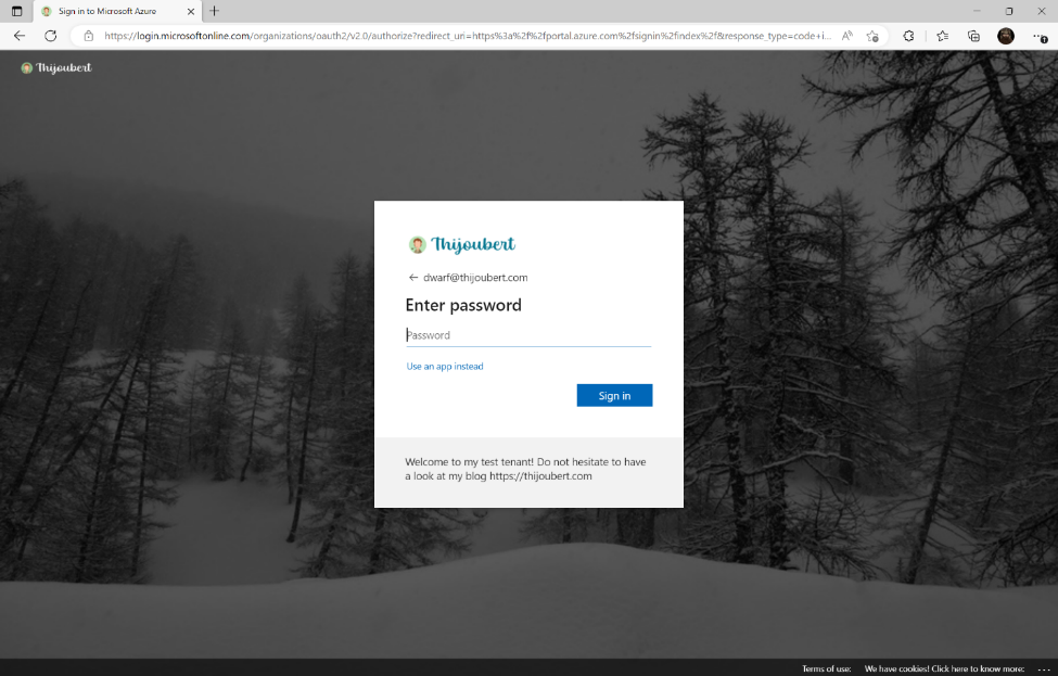
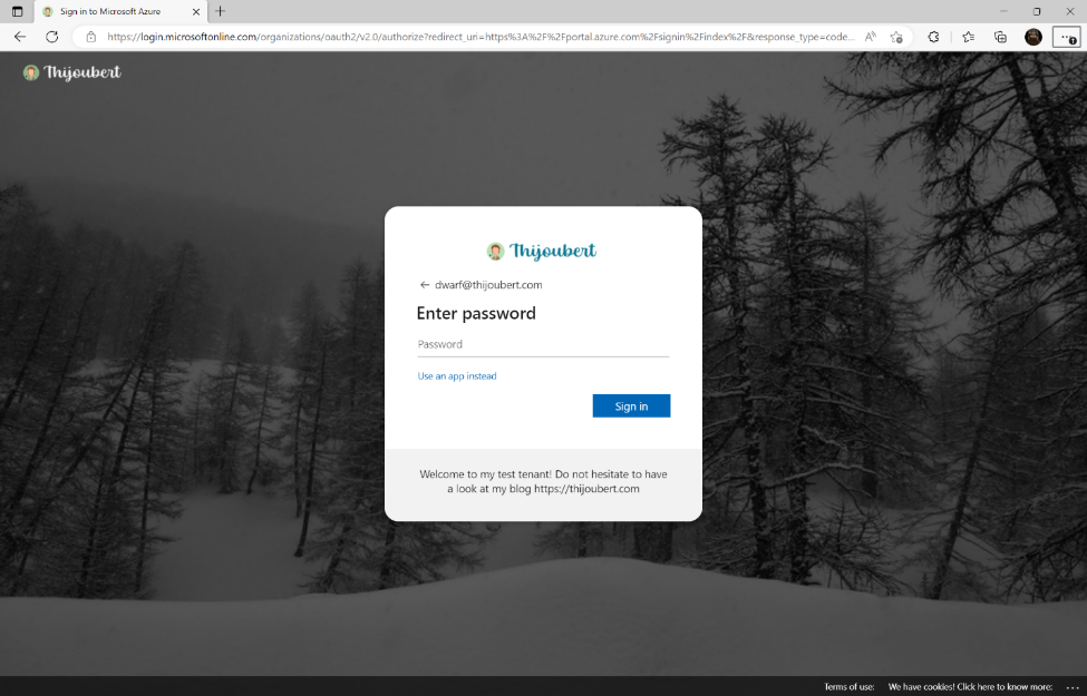
- Sign-in text for a welcome text
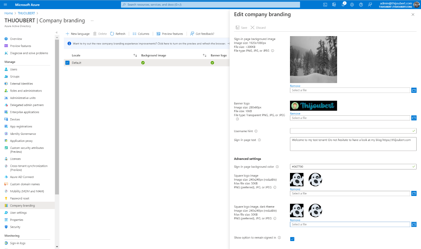
Although a welcome message is nice, I have seen several tenants display: “You can sign in with your email address” firstname.lastname@thijoubert.com. I’m not sure it’s necessary to inform potential attackers what the User Principal Name of the users looks like…
Introduction of the new company branding capabilities
Now let’s deep dive into the new capabilities.
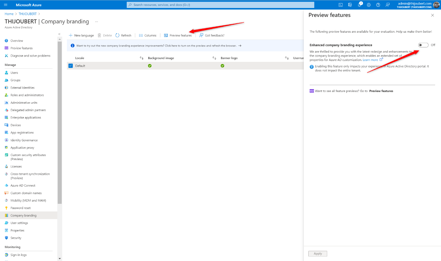
How to switch to the new company branding experience
The first thing to do is to activate the functionality that is still in preview. For this, you have two possibilities:
- Either you are already using the existing functionality and you just have to switch to the preview
- Or you can directly create a new template in the new experience (the latter being activated by default for tenants without company branding).
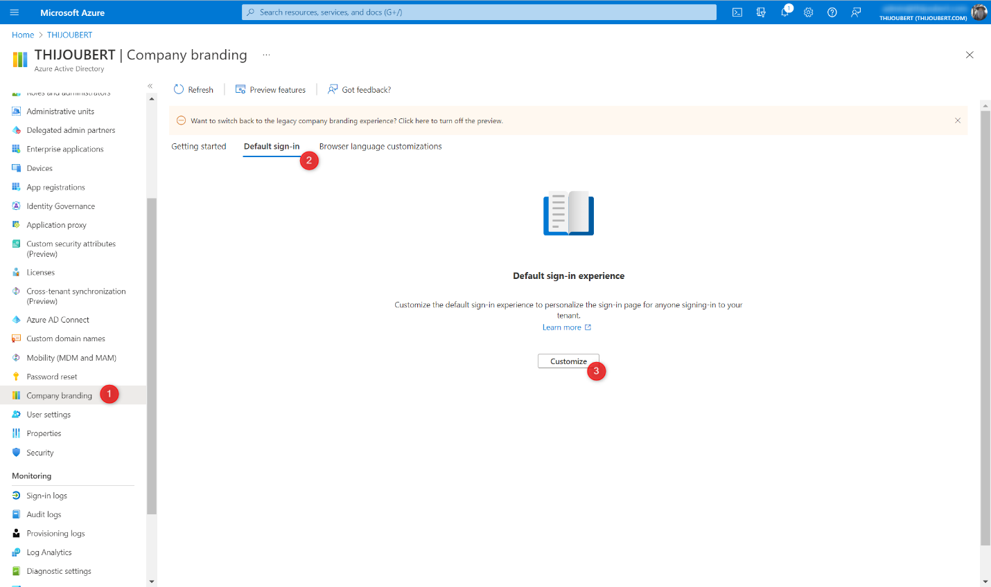
How to configure the new company branding
To configure the new company branding experience, 5 simple steps are required. The hardest part is to get the images and icons in the right size and format.
1. Basics:
In this first section, we find the main graphic elements:
- Favicon for the icon visible on the web tabs
- Background image for the main background image of the sign-in page
- Background color for the background color in case of failure to load the background image
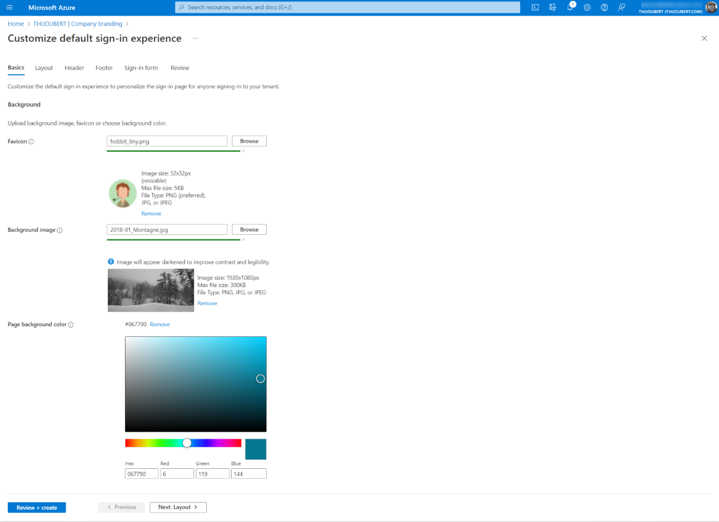
From what I’ve seen, it’s not essential, even if recommended, to follow the dimensions of the images. It is possible to do more or less. On the contrary, the indicated sizes are maximum (even if the error message is not very explicit: “The file type uploaded for this image type is too large”.)
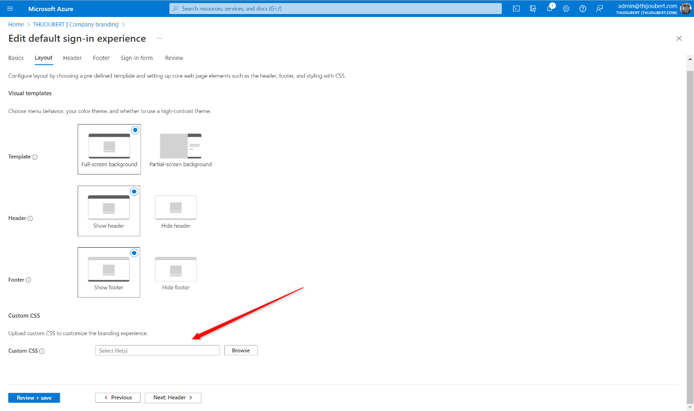
2. Layout
In this new part, 3 parameters are available to manage the layout of the page:
- Template: Choice between the classic Azure AD or ADFS login experience
- Header: Display or hide the header (with the logo)
- Footer: Display or hide the footer (with terms of use and cookies)
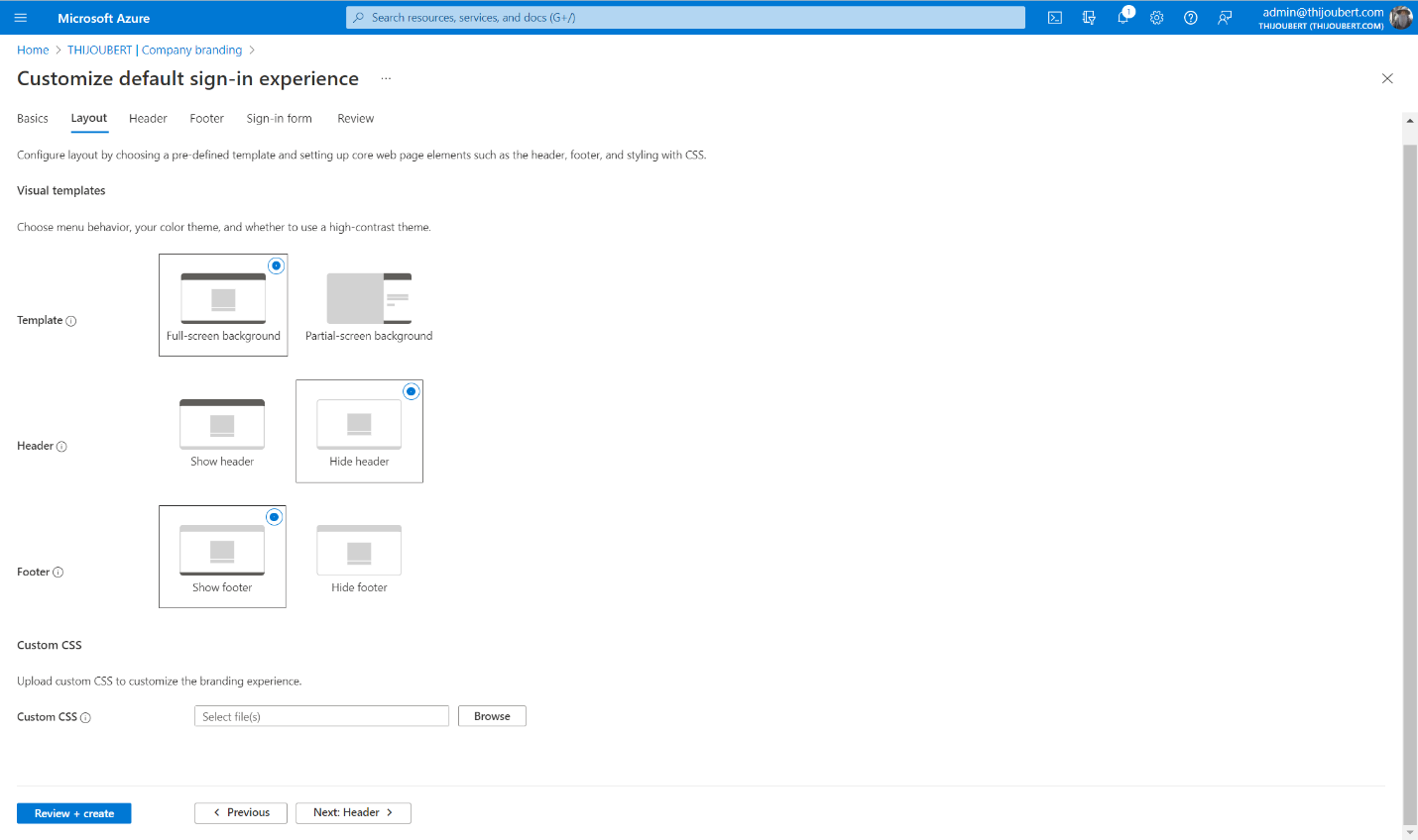
It is also possible to upload a CSS file to customize the page layout, but I will return to that at the end of the article.
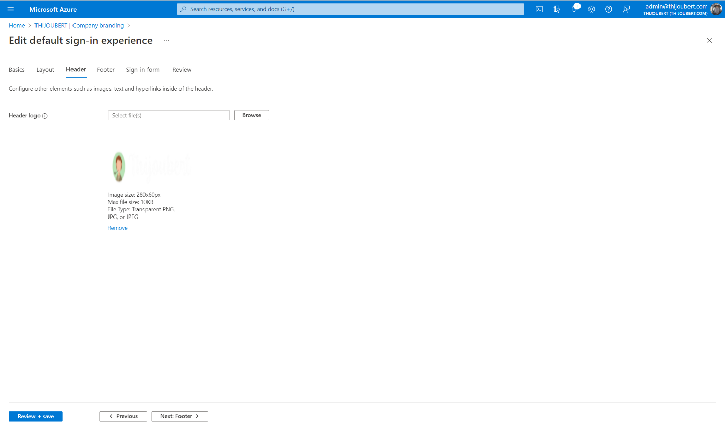
3. Header
The customization of the header is very simple, as it contains only the logo of the page, displayed by default in the upper right corner.
4. Footer
The footer contains the “Terms of Use” and the “Privacy & Cookies” description.
Until now, these two elements were not manageable by the organization and referred to the information of Microsoft :
With the new experience, it is possible to decide whether to display or not these elements and modify the texts or the URL.
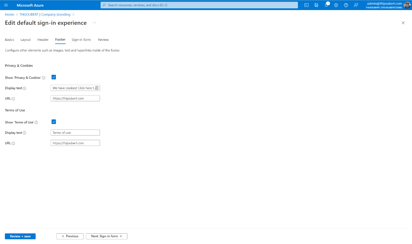
The terms of use are not necessarily those displayed by conditional access.
5. Review
The last page usually allows you to review all the parameters defined for the company branding.
In my tenant, the “Show Privacy & Cookies” and “Show Terms of Use” settings are displayed as hidden, whereas this is not the case. This should be corrected at the end of the preview.
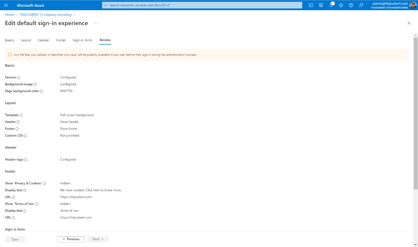
It is important to keep in mind that the parameter to manage the “Keep me sign-in” (or KMSI) behavior was moved to the user settings.
And here we go:
How to go further with the custom templates
The improvements introduced in the UI (favicon, default template, header, footer, SSPR customization) are nice. But what is most interesting for the sign-in experience is the custom templates part.
This new feature allows administrators to manage the layout of the page. For this, Microsoft provides a CSS template in which 45 elements can be customized, such as :
- .ext-header-logo: Styles for the header logo at the top of the page
- .ext-sign-in-box: Styles for the sign-in box container
- .ext-banner-logo: Styles for the banner logo displayed inside the sign-in box
- .ext-boilerplate-text: Styles for the custom message text at the bottom of the sign-in box
- .ext-promoted-fed-cred-box: Styles for sign-in options text box
For my demo tenant, I wanted to make some improvements to the default template:
1. Increase the size of the header logo
.ext-header-logo
{
    max-height: 50px;
}
2. Round the corners of the main sign-in box and the secondary options
.ext-sign-in-box
{
    border-radius: 20px;
}
.ext-promoted-fed-cred-box
{
    border-radius: 20px;
}
3. Center the logo in the main sign-in box
.ext-banner-logo
{
    max-height: 36px;
    display: block;
    margin-left: auto;
    margin-right: auto;
}
4. Center the explanatory text under the main sign-in box
.ext-boilerplate-text
{
    text-align: center;
}
On the other hand, I haven’t found a way to hide the sign-in option with GitHub, only the whole secondary block of sign-in options.
And here is the result with the customized template :
The design can be greatly improved. I’m not a UX / UI designer, but these new possibilities are promising.
The company branding can be customized for each of the browser’s display languages.
However, defining a sign-in experience for groups of users is still not possible. This could be useful for some large organizations that would like to have authentication pages for each of their entities, as IT is centrally managed in a white-label approach.
To go even further
If you want to define several templates, to adapt the branding to different languages, automation will be mandatory.
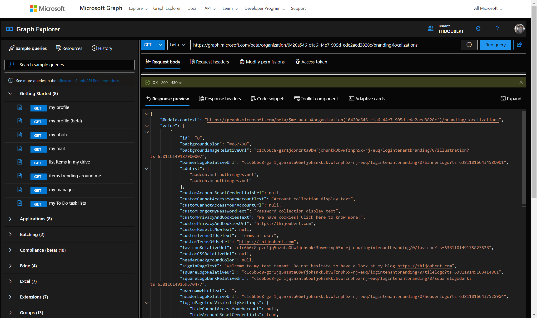
With Graph Explorer, extracting the organization’s brand before editing the content is very easy. GET https://graph.microsoft.com/beta/organization//branding/localizations
Company branding capability brings interesting features to modernize the sign-in experience while allowing you to stick to your corporate identity.
It should be noted, nevertheless, that this page can be copied by malicious users and will not be the ultimate defense against phishing attempts.
Anyone attempting to connect with the address fakseuser@mydomain.com will be able to access the sign-in page and its components. It will also be appropriate to avoid giving too much information about the format of the main user names of the organization.
Sources: